IN A NUTSHELL Author's noteThis article asks whether an AI-driven health score can turn information about long-term risk into behaviour that actually changes. It begins with an experiment: an AI tool built to estimate life expectancy, and what happened when the apparent precision of its output was tested. The number was removed. What follows examines feedback and its limits, drawing on the evidence for in-car and roadside driver feedback, personalised risk communication including genetic risk, the NHS heart age test, Geoffrey Rose's distinction between sick individuals and sick populations, the nudge literature after correction for publication bias, and the arrival of consumer-facing continuous monitoring. The central argument is that measurement is most useful when it is immediate, attached to an achievable action, and embedded in a cycle of feedback, incentive and repetition. The article argues against false precision, and against assuming that information alone changes what people do, while recognising that modest effects can still produce substantial benefit at scale. It concludes that the future of health dashboards lies not in producing ever more authoritative numbers, but in helping people see what they can change, act on it, watch what happens, and keep going

By Philip J. Gover, BA, MA, MPH, FCMI, FRSPH
Cambodia
Comments welcome

For partnership opportunities: philip.gover@cooperation.works

 By the same Author on PEAH: see HERE
AI, Health Dashboards and the Future
I Built An AI Tool To Predict How Long You Will Live, Then Checked Whether The Idea Works
There is a small piece of engineering in most cars that changed how people drive, without ever saying a word to them. It is the little screen that shows how much fuel you are using, right now, as you drive.
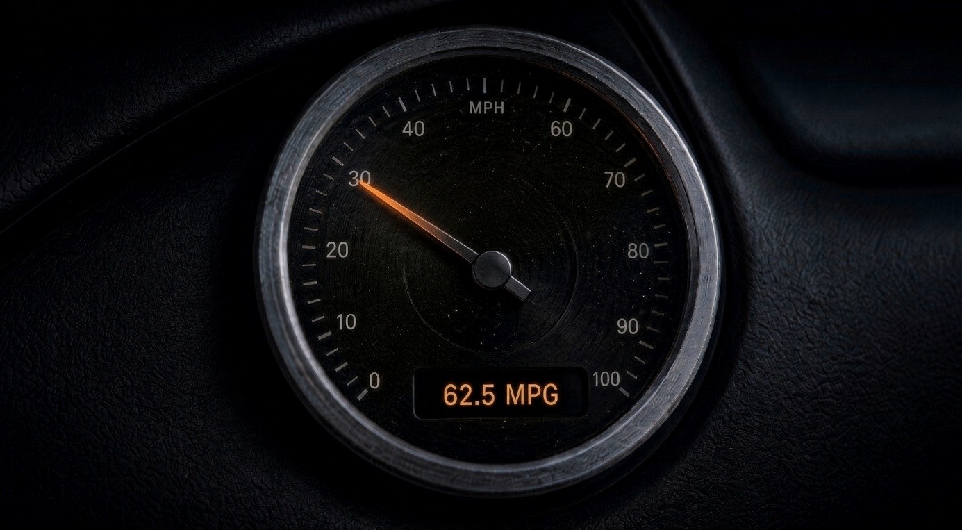
Before it existed, everyone already knew that heavy acceleration burns more fuel. It was not a secret. It was on the news whenever fuel prices rose, and in the cost of filling the tank each month. Almost nobody changed their driving habits. Then the number appeared on the dashboard, moving as you drove, and people began to ease off. They had not learned anything new. The cost had simply stopped being an idea and become something they could watch while their foot was on the pedal.
That gap, between knowing a thing and feeling it at the moment you act, is where most good advice dies. I have come to call it the dashboard problem. Health looks like the worst case of it. Very few people lack information. Most adults can recite the list: move more, drink less, sleep properly, check your blood pressure, do not smoke, do not sit still all day. We are not failing a test of knowledge. We are failing at attention.
The feedback in health arrives 20 or 30 years late, which is to say it does not arrive at all. You cannot feel your arteries. There is no pedal to lift, and no gauge on the dashboard for that. The obvious move, and I made it, is to build the gauge.
What I Built
I spent a while building a prompt: a set of instructions you paste into any AI LLM assistant. It asks 23 questions, one at a time, the way a good doctor asks them rather than the way a form asks them. Your age. Whether you smoke. How much you drink. How you sleep. The state of your gums. Whether your father died at 61, and of what. Whether there is anyone you could telephone at three in the morning. At the end, numbers. Your likely age at death, with a range around it, and a table showing how that range if you changed the two or three things most worth changing. Know your number. It moved is a good hook, and I liked it very much. Then I ran it several times with the same answers, and watched the number move by years. That is a story, not a test, and I will not dress it up as evidence.
What it did was send me looking further and looking properly: first at what the tool was doing, then, less comfortably, at whether the whole idea works.
The Number Is Not Real
The obvious complaint is that an AI large language model is not an Actuary. It has no lifetables inside it. When it says “79, with a 95% range of 71 to 86”, It has not calculated anything. It has written a sentence of the shape that such sentences usually take, and filled it with digits that feel about right. Asked directly, it says as much itself. However that could be fixed, by connecting a real published risk model and doing the arithmetic honestly.
Yet the deeper problem still survives the fix. How long any one person lives varies enormously, and no questionnaire reaches most of that variation. Ask all 23 questions, measure every answer perfectly, and the remaining spread is still far too wide to plan against. A truthful range is not a dashboard. The precision that makes the tool exciting is exactly the precision that does not exist.
Of what I know about the human condition, I also thought about what a numerical warning label is likely to do inside the human mind. We imagine it lowers the reader’s confidence. It does not. It sits above or below the number, and the number is what stays. Tell someone their life expectancy estimate is 79, wrap it in six paragraphs of statistical humility, and ask them to come back two weeks later. It’s unlikely that they will remember the humility. They will remember 79. A few will be frightened in a way that helps nobody, and those few will often be the people who answered the question about anxiety and depression honestly. I took the numbers out of the conclusion.
Not softened, not hedged, not padded the language with the words “might” and “suggests”. Removed them, with a written instruction that the tool must refuse to produce one even if the user asks directly, and must explain why.
Does The Dashboard Idea Even Work?
Having taken the roof apart, it seemed fair to look at the foundation. Starting with the car, since I opened the article with it. Sanguinetti and colleagues (2020) pooled 17 studies of in-car fuel economy feedback. The average improvement is 6.6%. That is real and worth having, yet a good deal smaller than the story I have been telling you.
Two details matter here more than the headline. The feedback that worked best combined the instant reading with the running total. And separately, the effect shrank the longer the system was in place, as drivers stopped noticing a screen that was always there.
Now a second dashboard, one you have probably driven past. Those roadside signs that flash your speed back at you as you approach. Flynn and colleagues (2020), pooling 43 studies, found they cut car speeds by about 4 miles per hour. That sounds trivial until you learn what 4 miles per hour buys at 30 to 35 miles per hour: up to 40% fewer deaths when a car strikes a person on foot. Look at the two together and a pattern appears. Both signals are immediate. Both refer to something your body is doing at that exact second. Both are attached to a small, specific action: lift your foot.
Where those conditions hold, feedback works, modestly, and fades as people get used to it. A predicted age of death has none of those properties. You read it once. It refers to something decades away. It is attached to no particular action at no particular moment. As such, my own analogy breaks at precisely the point where my argument needed it to hold.
Then I Checked The Premise
My whole idea rested on an assumption: that showing people their personal risk changes what they do. I had never examined it. The evidence is not kind. French and colleagues (2017) came at this from above. Rather than running another study, they gathered 9 separate reviews of the existing evidence, which between them covered 36 studies, some appearing in more than one review. Their conclusion was that presenting risk information on its own, even when it is highly personal, does not produce strong or lasting changes in behaviour. Not one of those 9 reviews reached a more hopeful verdict.
Hollands and colleagues (2016), writing in the BMJ, looked at perhaps the most personal risk information of all: your own DNA. They found that telling people about their genetic risk had little or no effect on smoking, diet or exercise. It did not even change what they intended to do. The kind of tool I was building has been examined too. Bonner and colleagues (2019) judged the NHS Heart Age Test against the standards used for screening programmes and found it failed nearly all of them. No trial shows it saved lives. Of roughly 2 million users, 78% were told their heart was older than their real age.
A tool that tells three quarters of a country it is ageing badly, with no proven path for what happens next, is not obviously a gift to anyone.
The Bigger Objection
There is an older and harder version of this argument, worth knowing even if you never touch my questionnaire. Rose (1978) published a paper called “Sick individuals and sick populations”. It is one of the most quoted papers in public health, and its argument is simple: there are two ways to prevent disease. You can find the individuals at high risk and work on them. Or you can change the conditions that produce the risk in everyone.
Rose showed that the first approach, the one that feels obvious, achieves less than people expect. Most cases of most diseases come not from the small group at high risk, but from the very large group at moderate risk, simply because that group is so much bigger. Sorting individuals finds markers of who is vulnerable. It does not touch the cause.
The History Supports Him
In 1854, during a cholera outbreak in London, John Snow traced the deaths to a single public water pump on Broad Street, and had the handle removed. Nobody was persuaded of anything. The water simply stopped being available. Even this story is tidier than the truth, since the outbreak was already fading when the handle came off. The principle holds: you do not teach people out of cholera; you take away the pump.
Closer to living memory, Britain spent years campaigning for people to wear seat belts. By the end of all that campaigning, roughly 40% of drivers and front seat passengers were wearing one. In January 1983 it became the law, and wearing rose to around 95% almost immediately. The Department of Transport’s own analysis of police casualty records found that deaths then fell by 25% among drivers and 29% among front seat passengers, with serious injuries down 21% and 30% respectively. Years of information got to a 40% plateau. One change in the rules got the rest.
A third example sits closer to where I live, and it makes the point in a different way. In Cambodia, drowning is the leading cause of death among children. Hile Teuk Kampuchea, an NGO whose name means Swim Cambodia, reports that around 2,000 children drown here every year, which is roughly 6 a day. The organisation could have run a campaign telling parents that water is dangerous. Parents in a country of rivers, ponds and flooded rice fields already know that water is dangerous. Instead it teaches children to swim, trains them in survival skills, and prepares teachers so that water safety sits inside the school day rather than on a poster.
Notice what that is. It is not aimed at the children most at risk, identified in advance by some questionnaire. It is aimed at all of them, and it moves the whole group a little further away from harm.
That is Rose’s population strategy in its plainest form, and it is the difference between telling people about a risk and changing what they are able to do about it. The most sobering evidence is recent, and it comes from Sir Michael Marmot. He chaired the World Health Organisation’s commission on the social determinants of health, and his 2010 review became the reference point for health inequality policy in England. Ten years later he went back to look at what had happened. Marmot and colleagues (2020) found that for the first time in more than 100 years, life expectancy in England had stopped rising. It stalled between 2010 and 2018. For women in the poorest tenth of the country, it did not merely stall. It fell. The report puts this down to child poverty, housing, the loss of local services, and deaths from suicide, drugs and alcohol among working age adults. However few in that account died prematurely of a failure to know of those risks.
Here I have to be careful, having spent this whole article objecting to overreach. A national trend says something about where the leverage sits. It says nothing about what a questionnaire does to the person filling it in. Mixing those two levels is a well-known way to reach a confident wrong answer, and I am not going to pretend Marmot’s figures are evidence about my tool. They are evidence about the size of the thing my questionnaire is not touching. What the record does support is a question about effort. If the large gains come from prices, laws, housing, clean air and clean water, then a personal risk score is not merely imprecise. It is aimed at the wrong level.
It asks an individual to solve, alone and after the fact, something that keeps being produced upstream.
What About Nudge Theory?
A fair objection at this point is that there is a middle ground between informing people and regulating them, and it has a name. Nudging changes the setting rather than the message: put the healthier option at eye level, make the pension the default so people have to actively choose whether to opt out, or reword that key letter so the form actually gets returned. It is one of the most influential ideas in behavioural policy of the last 20 years, and it is, in principle, exactly the sort of thing I have been arguing for.
The difficulty is not that nudging does not work. It does. The difficulty is that its effects are usually much smaller than the enthusiasm surrounding it suggests. Mertens and colleagues (2022) pooled the nudge literature and reported an effect that looked healthy, at 0.43 in the standard units’ researchers use. Maier and colleagues (2022) took the same data and corrected it for publication bias, which is the tendency for studies that find something to get published, while studies that find nothing sit in an unclaimed drawer. Corrected, the effect fell to 0.04, which is close enough to nothing that the authors said so in their title.
Then the real world. Della Vigna and Linos (2022) examined 126 trials run by two large government nudge units in the United States, covering more than 23 million people. Nudges in academic journals showed an average effect of 8.7 percentage points. The same kinds of nudges, run at scale by the people whose job it is, produced 1.4 percentage points. Real, worth having, and roughly six times smaller than the published literature suggests.
I take two things from this. The first is that nudging works, but modestly. That is not a criticism. A 1.4 percentage point improvement applied to 23 million people is a great deal of good, and it is still cheaper than almost anything else on the list. The mistake is expecting a nudge to transform behaviour on its own. The second is that we should be much more honest about what nudging can achieve.
An effect that is genuine, modest, and repeatable is useful. It only becomes disappointing when we compare it with a promise nobody could keep. Small and honest is not the same as useless.
What Is Left
Less than I hoped, and more than I expected. My original questionnaire no longer gives you a number. It gives you a sorted list of the things you could change, largest first, in your own words, and a short set of questions to take to your next GP appointment. That is a weaker instrument than a dashboard, but an honest one.
The part I now think matters most is the 20 minutes spent answering them properly. Sitting down and being asked, one question at a time, when you last had your blood pressure checked, and how your mother died, and whether you have someone to call at three in the morning, is the useful part. The report at the end is closer to a receipt.
What Is Coming, And What To Make Of It
Health dashboards are continuously evolving, and they will not look like mine. The use of the glucose monitor is the clearest example. It was built for people with diabetes, and it does what a good dashboard is supposed to do: it shows you, within minutes, what a particular meal did to you. Immediate, repeated, attached to an action you are taking now.
Access to affordable smart watches, that already estimate sleep stages and heart rhythm will help close the gap. As AI improves, more of this will be stitched together, and the sales pitch will be a single score that describe how you are doing.
Some of that is worth welcoming. A measurement close to the action beats a lecture about a risk you will face decades away, which is the whole argument of this article. Continuous data can catch things early that an annual appointment misses. For people far from a clinic, and for the many countries where seeing a doctor means a journey and a lost day’s pay, a decent, accessible and affordable smart tool in a pocket is not a gimmick.
There is, a place for dashboards. I have perhaps been too hard on the idea itself. The useful dashboard is not the one that simply tells you how healthy you are. It is the one that sits inside a lifestyle and a cycle of action. It shows you something you can change, gives you reason to change it, lets you see what happened when you did, and furthermore gives you a reason and incentives to do it again.
The dashboard is less a display than part of a feedback system: measure, act, see the result, adjust, repeat. The incentive matters too. It does not have to be financial. It might be reaching a milestone, unlocking the next stage, receiving positive reinforcement, meeting a challenge, or simply seeing that something you did produced a better result. The important thing is that the information has somewhere to go.
A dashboard that produces information and stops there is just another form of advice. A dashboard connected to achievable actions, meaningful incentives and repeated feedback can become part of the behaviour itself. This is not only intuition. It is what Sanguinetti and colleagues found in the driving data: the feedback that worked best paired the instant reading with the running total, and comparison standards, game elements and small rewards all pulled in the same direction.
Three Things Are Worth Doubting
The first is precision theatre, which is the failure I have just described in my own work. A number carried to one decimal place, produced by a system with no idea how wrong it might be, will always feel more authoritative than it deserves. Watch for tools that tell you what your reading is without telling you how uncertain it is.
The second is who gets them. If the people who benefit are those who already have money, time, a good phone and a doctor to interpret the output, then the technology widens exactly the gap Marmot spent his career describing. A tool that helps the comfortable and misses the poor makes the population figures worse while every person using it reports feeling better served. The country is told it is getting healthier. Only the better placed actually are.
The third is what happens to the data. A continuous record of your body is the most intimate thing you will ever generate, and it is being generated on someone else’s servers, under terms almost nobody reads, has been consulted on or agreed to. The question of who can see it, and what follows for insurance and employment purposes is not a footnote to the technology. It is the technology. None of that argues against building these things. It argues for building them honestly, and for asking harder questions of the people who design and sell them, including the ones who write articles about how thoughtfully they built theirs.
If You Want The Prompt
I have not pasted it at the bottom of this post, for a reason. Questions about your parents, your sleep and your fears are not something to hand out like a leaflet, and I would rather send it with a note about what it will and will not do. Message me and I will send it over. It is free, it works in any of the main AI assistants, and it takes about 20 minutes.
Three honest warnings before you ask for it. It is not a medical assessment, and I am not a doctor. The entire purpose of the output is to send you to one better prepared than you would have otherwise arrived. You use it at your own risk, and I accept no liability for anything you do, or do not do, as a result of it. Your answers never come to me. The conversation happens between you and whichever AI Assistant you use. I have no access to it, no copy of it, and no way of seeing what anyone types. Nothing is sent to me, collected by me, or stored by me at any point.
What I cannot promise is what your AI LLM Assistant does with it. You will be typing your family medical history into someone else’s chatbot. Whether that is kept, reviewed by a person, or used for training is decided by that company’s policy and your own settings. Check them first. Use a private or temporary chat if you have one. Skip anything you would rather not have written down.
I still believe the dashboard problem is real, and that making slow burning risks visible is worth working on. I no longer believe you get there by inventing a number precise enough to frighten someone. I am now fairly sure that even a true number would not do the work we keep hoping it will do.
What is left is smaller and more useful. Show a person the two or three things genuinely within their reach. Give them a meaningful way to act on those things, see what happens, and have a reason to keep going.
Be honest that the showing is the easy part, and that the doing belongs to them, their doctor, and the conditions they happen to live in. That is a modest offer. It is also, on the evidence, about as much as a set of questions can honestly promise.
References
Bonner C, McKinn S, McCaffery K, et al. Is the NHS ‘Heart Age Test’ too much medicine? British Journal of General Practice 2019;69(688):560-561.
DellaVigna S, Linos E. RCTs to Scale: Comprehensive Evidence from Two Nudge Units. Econometrica 2022;90(1):81-116.
Durbin J, Harvey A. The Effects of Seat Belt Legislation on Road Casualties in Great Britain. Department of Transport, HMSO, 1985. With Scott PP, Willis PA, Road Casualties in Great Britain: the First Year with Seat Belt Legislation, TRRL, 1985. Wearing rates and casualty reductions as summarised in the RoSPA Road Safety Observatory synthesis on seat belts.
Flynn DFB, Breck A, Gillham O, Atkins RG, Fisher DL. Dynamic Speed Feedback Signs Are Effective in Reducing Driver Speeds: A Meta-Analysis. Transportation Research Record 2020;2674(12):481-492.
French DP, Cameron E, Benton JS, Deaton C, Harvie M. Can Communicating Personalised Disease Risk Promote Healthy Behaviour Change? A Systematic Review of Systematic Reviews. Annals of Behavioural Medicine 2017;51(5):718-729.
Hile Teuk Kampuchea (Swim Cambodia). Drowning figures and programme description from the organisation’s own published material. These are the NGO’s figures rather than independently audited statistics.
Hollands GJ, French DP, Griffin SJ, et al. The impact of communicating genetic risks of disease on risk-reducing health behaviour: systematic review with meta-analysis. BMJ 2016;352: i1102.
Maier M, Bartoš F, Stanley TD, Shanks DR, Harris AJL, Wagenmakers E-J. No evidence for nudging after adjusting for publication bias. PNAS 2022;119(31): e2200300119.
Marmot M, Allen J, Boyce T, Goldblatt P, Morrison J. Health Equity in England: The Marmot Review 10 Years On. Institute of Health Equity, 2020.
Mertens S, Herberz M, Hahnel UJJ, Brosch T. The effectiveness of nudging: a meta-analysis of choice architecture interventions across behavioural domains. PNAS 2022;119(1): e2107346118.
Rose G. Sick individuals and sick populations. British Heart Journal 1978; 40:1069-1077. Reprinted in International Journal of Epidemiology 2001;30(3):427-432.
Sanguinetti A, Queen E, Yee C, Akanesuvan K. Average impact and important features of onboard eco-driving feedback: a meta-analysis. Transportation Research Part F 2020; 70:1-14.